|
WHITE: it's clean, crisp, and classic; but it can also be BORING! Go ahead, you can admit that you've said it too - no judgement here. We've all seen that colorless spaces can exude elegance, but without some variety can easily become sterile and harsh. I've listed 5 tips below to keep your unpigmented color scheme from encroaching on the land of bland!
1. Which white is right... for you!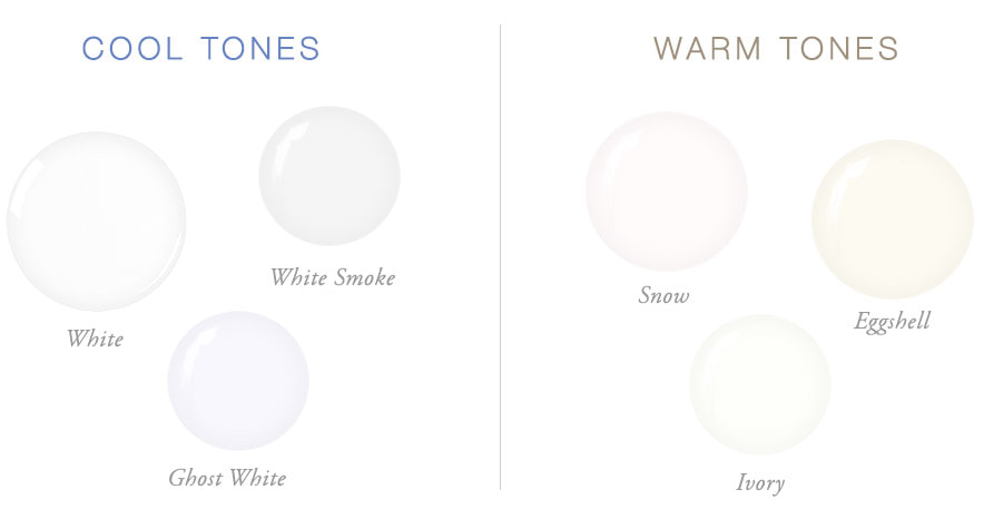
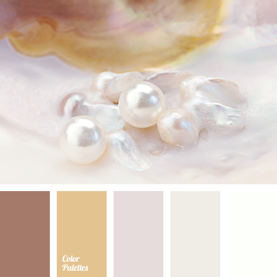
Wondering where to begin with white? Tones are a good place to start! If you live in a warmer climate, cool whites are usually a better choice, and vice versa - warm colors make a cold region more inhabitable (from the indoors, anyway). You can also pick your contrast colors first, and choose your white to match: if you want to decorate in blue, choose a cool white. If you'd love to decorate in shades of pink, choose a warm white.
If you're still not sure which you'd prefer, explore the paint section of your local hardware store and take home some chips. On a nice bright morning or afternoon examine the chips in the space you'd like to paint. This will help determine which shade will look best with your lighting and existing furnishings. 2. Utilize your palette
Even if you choose to decorate with neutral colors you can still build a beautiful palette to work from! White comes in many different undertones including pink, yellow, green, or even blue. Choose contrast colors that contain these same undertones to create a gorgeous neutral color scheme that still has interest. Just a tip: monochrome neutrals are better for large areas such as walls, floors and cabinets, and contrast colors look great in accents such as textiles and decor.
3. Take advantage of texture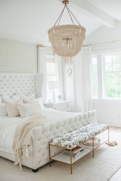
As you can see from the Monika Hibbs design above, texture can work wonders in a simple room! A tufted bedframe, a wonderful variety of hard goods, and an interesting (but still neutral) light fixture give this room character where there could have been none.
4. Use what you already have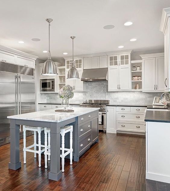
Itching for a kitchen remodel but can't afford it right now? Mix up the monotony by giving your kitchen island a face-lift. Contrasting kitchen islands are all the rage, and a fresh paint job is an easy and affordable way to change up your kitchen while you're saving up for the full reno you've been dreaming of.
5. Don't be afraid to compromise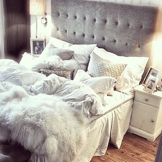
Chances are that if you have kids, pets, or both, an entirely white theme may not be right for you (especially if housework is not your favorite pastime). Don't be afraid to make compromises with other neutral colors like taupe, beige, or grey. Floor coverings, blankets/pillows, and other textiles can be easily washed; bigger items like couches and headboards, however are not - so opt for darker shades to avoid that unattractive dingy look.
Need some help choosing paint colors, furniture, or decor? Click on the Contact tab above to schedule a FREE design consultation!
0 Comments
|
AuthorElizabeth Strube, Interior Design Consultant Archives
June 2018
Categories |

 RSS Feed
